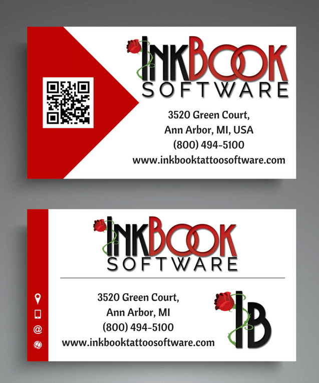
As a tattoo artist, you can’t leave your home without compelling business cards to share. Here are 7 amazing ideas for tattoo artist business cards!
There’s a reason why tattoo artist business cards are one of the only old-school marketing techniques that still remain relevant in today’s digital age: simply put, they work.
How Business Cards Help Tattoo Artists
Business cards represent an age-old method of branding, advertising and marketing, and creating top-of-mind awareness for the person holding it. We’ve found those tattoo artists who personally hand out business cards tend to see an increase in bookings because:
- They give you an opportunity to sell yourself and your brand
- They personalize the interaction between you and your client, especially if you have your direct number printed on the card
- You can make impressions and generate leads
- They help people know how to contact you
However, we’ve also found that not all tattoo artist business cards are created equal. Exchanging business cards has become somewhat of a commodity that most artists use. Which means if you want to see a bigger boost in bookings, your business card will need to speak loudly.
Check out these seven pro tips to make any tattoo business cards worthy of attention.
7 Tips for Tattoo Artist Business Cards You’ll Want to Copy
Differentiate yourself
With companies like Vistaprint offering super cheap (sometimes free) business cards and predesigned templates, it’s tempting to order a few hundred to build your brand.
Here’s our advice: Don’t. Yes, it’s cost-effective, but plenty of other artists have thought so too. That’s why you run the risk of choosing the same tired designs other competing tattoo shops might be using. Remember, effective tattoo artist business cards will stand out from the pack, not become wallet fodder.
Avoid the clutter
We realize you’ve probably heard the phrase “Less is more,” but it couldn’t ring any truer when designing your business card. Tattoo artists business cards should be short and to the point: “Here’s my contact information, call me for an appointment.”
There’s no need to list every single service you offer or clutter your card with tattoo-related clip art. Rather, opt for the basics:
- Your name
- Job Title
- Phone number (either salon or personal, but not both)
- Address
- Tattoo artist tagline for branding purposes
This is the most important information your clients need. Adding too much text can clutter your card and shroud out the crucial stuff. Also, using too many colors can create an additional volume that pulls focus from your contact information. Stick to a 3-color palette when possible: the main color, accent color, and text color.
Find your Muse
Your business card does all the talking about your brand when you aren’t around, so it’s important to craft a card that establishes customer expectations.
Ask yourself what kind of experience clients will expect based on your card design:
- Upscale designs?
- Trendy artwork?
- Walk-ins available?
- Prices by size or hours?
If you’re a freelance artist in a large tattoo shop, your card should match the brand of the shop. Get permission to use the tattoo shop’s logo if they have one, or see if they have a standard business card template you can use. Don’t use fun images and designs just because another tattoo shop uses them. Pretty pictures of butterflies might not fit in with, say, a more ‘die-hard’ tattoo shop. Consider your audience and brand, and work from there.
Engage the Senses
Business cards that engage more than one sense can boost the viewer’s retention and help your brand stand out. Consider including:
- An embossed embellishment
- Textured or thicker cardstock
- A glossy finish
Include an image
Your business card probably isn’t the only one a person carries. A simple image, design, or unique color scheme can help yours stand out in a sea of same-sized cards. Some tattoo artists business cards use tattoo-related images, such as different artwork designs. These work fine, but it’s important you choose an image that won’t look like every other tattoo artists business card out there.
Also, make sure the image makes sense for your brand. A tattoo shop mainly targeting men wouldn’t use a frilly abstract image to attract customers, like this example. One caveat here: You can’t just choose any random image from the internet. At least, not without copyright repercussions. Make sure you select an image you can use legally, such as Creative Commons, public domain, or your own design.
Use an easy-to-read font
Designing your business card makes the perfect time to build your brand image. But creativity shouldn’t come at the expense of illegibility or tiny print. When choosing a font, make sure it’s one that people can easily read. Nobody wants to spend time trying to decipher phone numbers or addresses when trying to make an appointment. But just because you shouldn’t use a frilly font doesn’t mean you have to stick to boring Times New Roman.
We recommend using clean, crisp fonts like Eras, Impact, Elephant, and Rockwell. You can also purchase fonts to create a more distinct look. To increase readability, we’ve noticed that serif/sans serif font pairings work well together. Experiment with different fonts and sizes before you send your cards to the print shop.
Make it multipurpose
Giving your card another purpose can prolong the amount of time a person is likely to keep it. For instance, you can include a tip calculator or coupon on one side with your business information on the other.
Bonus Insider Tip!
Did you know that business cards don’t have to look like actual cards? Think about it this way: the purpose of a business card is to present your prospect with your contact information in hopes you can stay top of mind when they need your service.This mirror business card not only gives the cardholder a convenient tool they’ll actually use but also looks super professional.
It’s okay to think outside the standard tattoo artist business card box too! Get creative, but remember whatever you choose, make sure it makes as big a statement like their tattoo artwork!
Need a Tattoo Software to help your growing business? Download InkBook absolutely free for 14 days!


